Anmelden
Melde dich an!
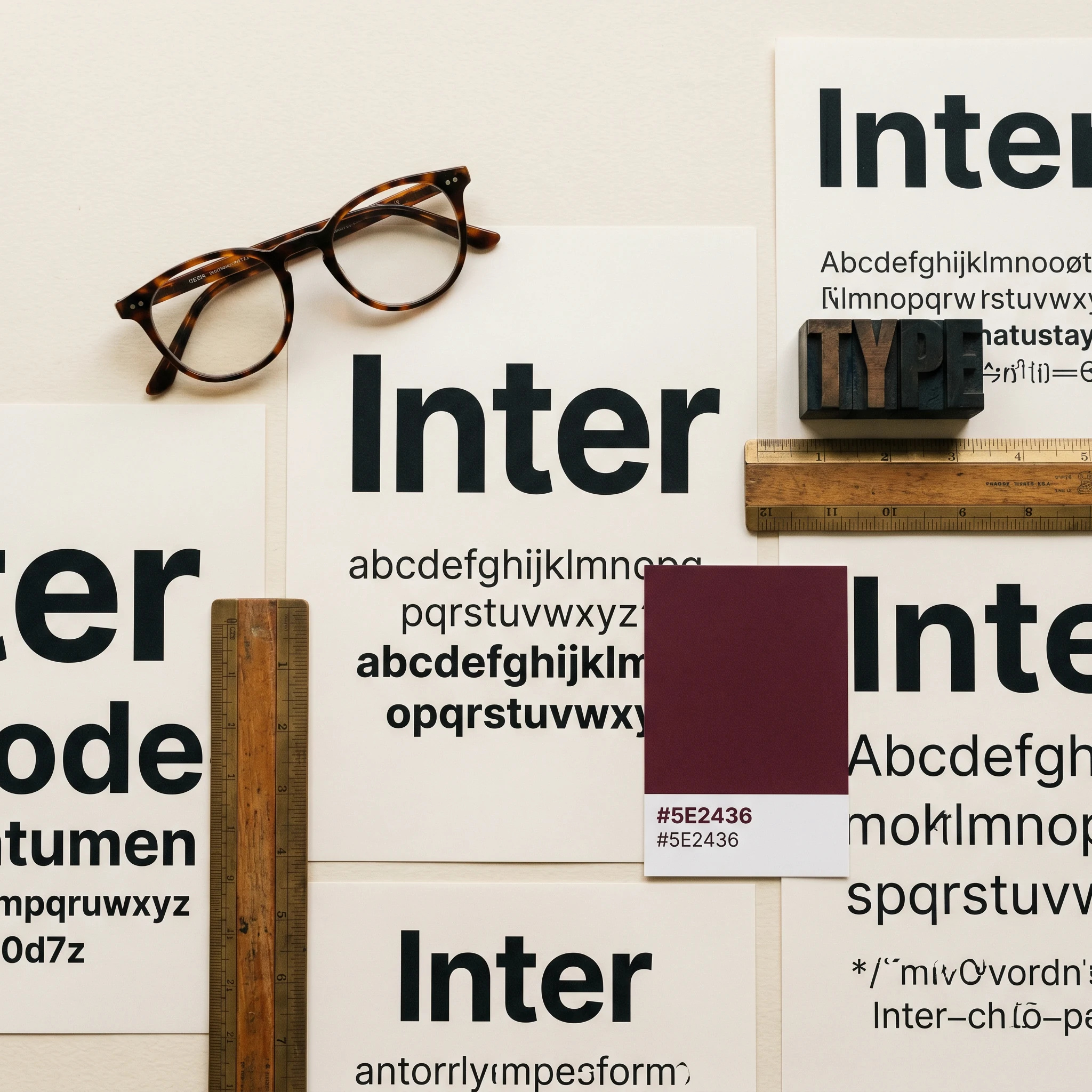
Typography
Typography isn't a font picker — it carries the whole brand.
Scrollen zum anschauen
Was die Leistung umfasst
What typography does for your brand
Brand typography is usually a list of two typefaces someone wrote into a manual. As the brand grows, the system is missing: which weights exist, which sizes go where, how the hierarchy behaves across web, print and app. Typography without a system falls apart after two years — and the brand's visual impression goes with it.
I develop type systems that work as a whole — a primary typeface with defined weights and sizes for headline, body and caption, a secondary typeface for special cases (monospace for numbers, display for the hero), and clear rules for hierarchy, line spacing and emphasis. Including web performance optimization (variable fonts, OpenType features, correct fallbacks) and licensing clarification — many foundries have strict rules that need to be in the manual.
After the work you have a type system your team applies correctly day to day, because it's clearly documented. Headlines look the same across platforms. Body text is legible on mobile and in print. And when someone builds a new touchpoint in two years — an app, an exhibition wall, a PowerPoint — the rules are so clear that the result fits the brand without anyone having to ask.
So gehe ich vor
How I approach typography
01 — Research. What the brand communicates today and where, which competitor typefaces carry which message, which pairings are sound functionally and in terms of licensing. Three to five typeface candidates — before any pixel tests.
02 — System. Based on the final typeface(s), define the size scale, set the weights, build the hierarchy across all channels. A concrete example per touchpoint, not abstract rules.
03 — Performance & licensing. Web optimization: variable fonts, loading OpenType features correctly, choosing fallback fonts so no FOUT shift is visible. Clarify licensing gaps — web vs. desktop vs. app often have different requirements.
04 — Documentation. A brand style guide chapter with real examples instead of abstract rules. When the team applies the typeface wrong, the manual is to blame, not the team.
FAQ
Häufig gestellte Fragen
One typeface with enough weights (Light to Bold, plus Italic) covers 80% of applications. A secondary typeface makes sense when specific applications call for it: monospace for technical figures or code snippets, a display face for hero headlines, a serif for editorial character. More than two typefaces is rarely sensible — and usually a sign of a missing type strategy.
It varies widely. There are excellent free typefaces (Google Fonts, some foundries), and at the same time speciality fonts priced with an annual licence and a page-view limit. A professional licence for web plus desktop typically runs between 200 and 2,000 euros per year — depending on the foundry, the number of weights and the application. Clarifying the licensing situation is part of the typography project.
In every modern browser, yes — variable fonts have been broadly supported since Chrome 62, Safari 11 and Firefox 62. A fallback to static weights is still worth having, in case someone arrives on an old browser or the variable-font file fails to load. The performance benefit is real: a single variable-font file covers every weight, instead of loading each weight separately.
Often yes. Many foundries separate web, desktop and app licences because the applications have different reach. A web licence typically allows one domain, a desktop licence allows n devices or employees, and an app licence is separate. Clarifying the licence is part of the typography project — otherwise costly back-claims can surface later.