Anmelden
Melde dich an!
UX — User Experience
UX means the user doesn't stop to think — they keep going.
Scrollen zum anschauen
Was die Leistung umfasst
What UX work does for your product
Many digital products are built without anyone asking whether they work for the user. Designers make them pretty, developers build them cleanly, marketing writes copy on top — and then the sales team realizes in demo calls that users drop off at the third click. UX work comes before this phase: what does the product have to do for the user, and where do barriers arise that can be solved before launch.
I work on the question of whether the product works before deciding how it looks. Concretely: user research (interviews, existing data, heatmaps), information architecture (what belongs where, in which order), user flows for the most important use cases, wireframes with the right components, clickable prototypes for usability tests, and handover to the design team with clear specs. For existing products, a UX audit too: where users lose time today, what slows conversion, what can be fixed with small interventions.
Your product works from the first touch — not after three iterations in which users correct the team. Conversion rates rise because friction points are solved before launch. And your development team doesn't build twice, because the requirements were clarified before the sprint.
So gehe ich vor
How I approach UX
01 — Understand. Who really uses the product, what slows them down today, where is value created? Interviews with existing users or potential buyers, analytics data where available, a heuristic check of the status quo.
02 — Structure. Information architecture and user flows before the pixel — wireframes, not mockups. Set the component logic, define navigation patterns, identify edge cases.
03 — Validate. Test clickable prototypes with real users before development begins. Five users are often enough to uncover the biggest friction points. Iterating on the prototype is orders of magnitude cheaper than on the finished product.
04 — Hand over. Design system and components documented so your team can keep building. A handover workshop with design and development — so UX decisions are understood, not just followed.
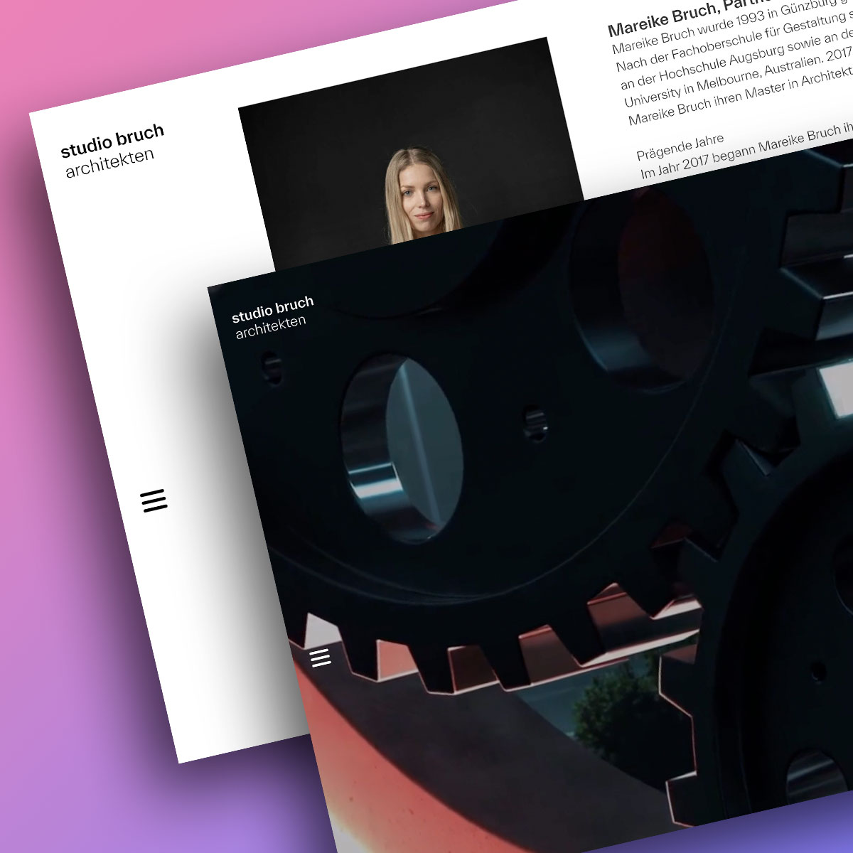
Referenz
Hier eine Beispielprojekt von mir

FAQ
Häufig gestellte Fragen
For simple marketing sites with a clear structure, a good designer is enough. As soon as the product gets complex (software, multi-step flows, many user roles), or when you're no longer sure what users actually need, UX work pays off. Rule of thumb: if your sales demos show users dropping out at the third click, what's missing isn't design but UX clarity.
It varies a lot by scope. A UX audit of an existing product is quick. A full UX process (research, wireframes, prototypes, testing) for a new product takes several weeks. In the briefing we agree on the depth and set the phases — fast, but not rushed. Iterating on a prototype is orders of magnitude cheaper than iterating on a finished product.
Real users beat internal assumptions almost every time. Even three to five user interviews usually surface 80% of the friction points that nobody internally had on their radar. If user interviews really aren't possible, we draw on secondary sources: existing support tickets, sales notes, heatmaps, session recordings.
It lives on with the product. During the handover phase I document components and decisions so your team can build new features without needing to ask. As complexity grows, a UX retainer for ongoing support makes sense — with a clear setup you can manage without one. Important: someone internal has to own it after handover, otherwise the system unravels.